Less

It feels strange to write a journal entry, given the aftermath of Helene, the upcoming US elections, and… and…

Here but for fortune~

Il lavoro è divertente, soprattutto. The Georgian Chamber Players (an acclaimed chamber music ensemble) just launched their new site, a pleasure to design. Three songs have birthed, after gestating for years. Now they’re learning to walk.

Relaxing solo or in company, still or in motion.

Alas, today there’s little desire to inform, educate, or entertain re: websites in this medium. It would feel like mania.

If you’re having a surge of creativity and want to bring it online, I’m too happy to help you realize your vision. If we don’t know each other well, we’ll need to talk first.

To rest,

See you on the other side.

The Soundtrack of Your Life

Long ago, when I worked in treatment settings, patients stayed for weeks. Sometimes months. They had the luxury of creating extensive, meaningful projects. A favorite — Soundtrack of My Life. Sometimes they improvised with musical instruments and voices. Sometimes they picked out songs and played them with (or without) commentary, while the other patients bore witness.

Everyone’s life has a soundtrack, one not frozen in time. Rather, it morphs as you morph, changes as you change. Don’t we all?

Now, mostly, my clients are standing on some sort of threshold. Common themes: Where am I now, what do I offer, what’s going to happen in the future, and why on earth am I doing this?

Fortunately, your website can be just as fluid and dynamic as you are, reflecting your multi-sensorial soundtrack. Especially if it’s easy to update on the fly, or to have your designer go in for an hour or two. Squarespace is a perfect platform for making adjustments. With change, your reach will expand. Even adding a new blog post is good for search engine optimization (SEO).

I just finished a delightful collaboration with musicians who’ve composed a great deal of music for CNN. It’s a tall order to create soundscapes that powerfully, tastefully underscore national and world events.

As the Averys say on their site, It’s safe to say his music has changed the landscape and impact of television news, and is even inspiration for this sketch on The Daily Show.

Click or tap the image below:

Curve and Line In Web Design

I’ve worked with two delightful women on their site creations recently. Both are compelling. Both are musicians.

Their site designs couldn’t be more different.

Yes, a good thing. I first came up with the color schemes. The photos they sent showed the way. That was after picking movie palettes they liked, and (maybe!) telling me the main colors in their closets and homes. Along with colors they wanted to avoid. Font choice? A separate article.

Something else is nearly as important as I bring the site together: straight lines vs. curves. Yang vs. yin. Who is this person? (Want to go down a rabbit hole in regard to style essences? Try this.)

Anyway, back to curve and line. Squarespace Fluid Engine offers a wealth of options. Not the dizzying array of Elementor, but I’ll take it. Straights, shapes, flow. One woman’s site lent itself to a fair amount of curve. Intensity, but waves came naturally.

The other required something else entirely—though I didn’t see it at first.

I usually know a site’s finished when it finally “settles.” The second site originally combined lines and curves, as my client seems to. At first glance. But underneath her balanced presentation, there’s a powerful linear undertow.

But I didn’t grasp it, initially. Instead, I kept moving the curved and linear shapes around, doing my best to harmonize them.

As it turned out, all I had to do was go totally angular. Curves were diluting her essence. Once I straightened out the lines, everything locked into place. She settled inside it.

If I’m designing for an organization, the key word is organization. I’ll be much more likely to put together a grid-like design, at least at first. Then, according to the ethos of the organization, bring in peaks and valleys.

I remember when Squarespace first came out. Its appeal was its rectangular simplicity—minimalism. Restful to the eye. If you wanted to put in curves, you had to wrangle with custom CSS. Now, choices abound. And it’s tempting to throw everything at a design at once.

It takes care to strip away the extraneous to reveal the best choice, but it’s worth it.


Websites of Legacy

I’m increasingly concerned about ephemerality.

Large white houses with black trim spring up like specters all over the city. Historic (including midcentury!) homes bulldozed. All over.

Sometimes, I tell friends that I feel like an iPad; wisdom (foolishness), memories, fragments pass through. It’s so relaxing and better this way. But to cognize, I have to fetch, intentionally. Like an app. I wear apps. Which use energy.

Overflowing—a drawer of memorial service bulletins. Mourning and marveling at these lives, knowing what was shared was a tiny sliver. I know loving families keep them, wholly. If there are families.

What does any of this have to do with websites?

Nothing, really. But what about deeply lived lives, and the websites I see that represent them?

For the most part, they do no justice.

It takes time, so much time. And intense attention.

Here are two that I’ve recently spent time on, with recent honors and updates:

Frank Hamilton: The Film—Legendary folk artist, teacher, and activist. The documentary Frank Hamilton and the Folk Revival has been nominated for a Southeast EMMY® award.

Chalice of Repose Project—Representing the current work and legacy of Therese Schroeder-Sheker, founder of Music-Thanatology, acclaimed musician, clinician, educator, and Benedictine oblate.

I think of so many others who need this deep attention and attempt at comprehension.

Lean In

No, I’m not talking about the book.

I’ve never been more convinced of the value of leaning into what makes you singular. Into what you’re uniquely wired to express. Into what no one else can duplicate. Creatively. Relationally. Vocationally.

I’ve been on acclaimed copywriter Peter Bowerman’s email list for decades. Always, I open it. Always, I learn. I’ve worked with him a bit, too. He blows it away in the human-touch department. He leaves me feeling brighter and stronger.

Even though our visual and communication styles may differ (his website!), he’s taught me so much (by example) about leaning into what makes you distinctive.

Yes, I’ve considered not basing this site on my joy-place aesthetic—though yes, pastels and brights can be yours, if you wish.

Yes, I’ve thought about making this whole thing more corporate-y—more marketing speak-y.

I’ve also considered the corollary, music-wise.

No, none of that will work.

What will happen, though, is once we’ve decided to proceed, you’ll have my full attention. I’ll listen to your music. I’ll take in your videos. I’ll edit photos and become happily familiar with your face. Without fail, I’ll have a dream or two about your work.

You’ll have questions. So will I. You’ll dive into who you’ve been, are, and are becoming. You’ll make adjustments. If you want, you’ll learn Squarespace basics so you can update—or pass the task along to me. We’ll probably have laughs and cups of hot beverages along the way. That might be my favorite part.

When we’re finished, your site will be striking. Classy. Extremely easy to navigate. Worthy of you.


In Praise of Pexels

I love the word Zhuzh. I heard it first in a stylist’s chair, as we experimented with new and different ways to make my hair stand on end.

Our friend Merriam-Webster has the following to say:

In web design, it’s also fun to Zhuzh. Sometimes, I wait until the basic design is done before I bring it in. In other situations, it helps energize me and the design, even if we end up tweaking it later.

My main zhuzh tool? Pexels video. A royalty-free, fairly sophisticated, and super-varied collection of thousands of clips, mostly silent.

Need a striking banner background on your Squarespace site? Start there. Want to give your visitors a lovely surprise in the footer (my favorite trick)? Put a complementary, subtle video underneath at .5 speed or so, and soften it with an overlay so the copy on top is easy to read.

A few weeks ago, I wanted to experiment with the potential of Pexels, so I took a song I wrote (Looking Glass) and searched for videos that expressed the feel as closely as possible. Pexels delivered. It was a humbling experience. And gave me new respect for those of you who work with moving image.

I’m into Terrence Malick. Memories of his 2016 film Song to Song came to me as I finished up. A poem that Faye reads near the end:

For Mercy has a human heart
Pity, a human face:
And Love, the human form divine,
And Peace, the human dress.

~William Blake

It's More Than a Website

Yes, in the everyday scheme of things, it’s only a website.

But if you are a prolific and original creator, there’s more. It’s a representation of your heart and artistry. It’s your intellectual property.

To protect it by using applicable trademarks, copy protection, and retaining wise counsel—critical.

Don’t wait.

Additionally, before putting anything up on your site, consider what you want your legacy to be. Honorable? Then make sure all aspects of your offerings (yes, including the downloads) are original (not watered-down versions of others’ sacred work).

Attribute your sources. Honor your mentors. And remember—there is power in a name.

It's Only a Website

It may seem counterintuitive for me to say that website design is ultimately unimportant. But considering the vastness of being and change, it’s a drop—inside a drop.

My clients and I have met intriguing, perplexing challenges lately. What helps most is when we stop, laugh, sit back, and remind ourselves: “It’s only a website!”

Sites come and go. Trends in design morph and technology rapidly advances… not necessarily in accord with our wisdom.

Existence is full of joy and sorrow that far outweighs the importance of interfaces or color schemes. Birth, loss, the Goliaths we meet— these are the things that hold meaning.

The great equalizer is coming.

Our legacies are defined not by the online presence we've created, but by the impact we've had, the people we've touched. A site (or indeed, any online presence) may contain and reflect a legacy, but without real-world incarnation, it’s hollow.

Change is inevitable, continual. As we adapt to the changing conditions of our lives, shifting priorities and new challenges arise—waves. In the tech realm, new platforms and tools are constantly emerging.

While design excellence is certainly a priority when we work together, it pales in comparison to the vastness. May the focus be on what matters and on true legacy, rather than getting caught up in the trivial and ephemeral.

Your Colorscape

What do film palettes have to do with web design? Quite a lot, I think. When I first work with you, I’m interested in the colorscape of your life and vocation. How can we bring that into the design?

I’ve been away from writing here. Days are full. Finally, though, I’ve decided to put together a small email list for those who’d like to know when a new entry’s published. I aim for monthly—usually, it’s less. If I change the format or frequency, you’ll be the first to know and can stay for as long as you wish.

You’ll also get a head start on seeing the brief style questionnaire that I give new clients—it includes a link to the stunning colors of several iconic films. We’d have to simplify for our medium of course, but they’re a great starting-off point.

If you’d like that, head to the footer.

________

Chances are, you’ll have a large banner photo introducing the site (though not all sites need one). Choose your cinematographer (photographer) carefully. Be sure s/he is capable of creating the look you want. Take a look at their portfolio. Consider your closet, and where the photo session’s going to be. The quality, color, and atmosphere of your (around 2500 px)-width) banner photo will make a crucial difference.

When your look, art/service, and message are unified, you’ll multiply your impact. Exponentially.

Time It Was

Remember the vintage Fabergé perfumes? Woodhue. Aphrodisia. Tigress! And Music.

This bottle sat on my Nana’s dresser for decades. After she passed away, I slept in her room. The air was fresh and light.

Upon leaving, I asked my mother if I could take Music with me.

Of course, she said.

It still smells of delight. There’s hardly any left. It doesn’t matter.

Now, a question.

Is your website multi-sensorial? Does it evoke a tactile, sensual experience? Does that experience entwine with the essence of who you are and what you offer?

If you’re a mature creator, I believe this is even more important. You, your life, and your handiwork over time develop a distinct, incarnational quality that can’t be duplicated online (no!)—but!—your online presence can point to it. Vividly.

Then, those who love what you love may find you.


5 Reasons To Have Your Own Website In 2023

Shall I call this a “guest post”?

~~~~~~~~~~~~~~~~~~~~~~~

Having your own website is important for a variety of reasons.

  1. It gives you a platform to share your ideas, products or services with a wider audience. You can use your website to showcase your work, share your thoughts and opinions, or promote your business.

  2. Owning a website can help you establish your brand and credibility. A website allows you to have control over your image, and how you present yourself to the world. This can be especially important for small businesses, freelancers, and entrepreneurs, as it can help you stand out in a crowded marketplace.

  3. A website can be an effective tool for building relationships with your customers or audience. By providing useful information and resources, you can establish yourself as an authority in your field and build trust with your audience. Additionally, by using tools such as email lists, social media integration and online forms, you can easily connect with your visitors and gather valuable feedback.

  4. Having a website can also be a valuable tool for online marketing and lead generation. With the right strategies, you can use your website to generate leads and drive sales. This can be done through search engine optimization, pay-per-click advertising, and social media marketing.

  5. A website can give you a sense of control over your online presence. Without one, you may be at the mercy of third-party platforms that can change their rules or disappear altogether. By owning your own website, you have the ability to control your content and ensure that it remains accessible to your audience.

In conclusion, owning a website is an important way to establish your brand, build relationships with your audience, and drive leads and sales.

Having a website is an essential component of any modern business or personal brand strategy.

~ ChatGPT

I watched the generation of this post with a mix of fascination and horror. Lots of “cans” in there. The points are valid. The style is generic. I could’ve indicated a preference for the style of the New Yorker or the New York Post!

Created by a non-human entity. The implications …

I hope that search engines become ever more adept at detecting AI-generated text and other “creations,” and file them where they belong. Let’s see what happens to this one.

In Praise of Print

I’ve been basking in the pleasure of print magazines. It’s been a necessary antidote to the glare of screens, the roll of scroll. Touching the pages. Satin, glossy, rough. The weight, the thickness. Images and words traced with a finger. An antidote to the ephemeral.

The tactile — the real! — of print feels comforting and welcome, especially this season. Palettes, images, and fonts, the way they wind and flow. Relationships. Proportion. The negative space refreshes. Breath, wonder.

In honor of the beauty of print, here are several magazines that inform and delight me. You might find them satisfying, too.

Every issue of No Depression I’ve bought, I’ve kept. Can’t let them go. Truly a “coffee table” publication, it’s rich, thick, satiny, and weighty. They use the highest-quality ink. The photography is varied and stunning. The articles and interviews with top Americana musicians compel and fascinate.

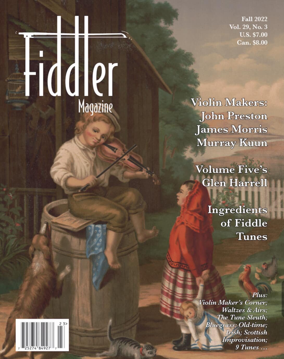
Fiddler magazine is an anomaly; it manages to be high-end and approachable at the same time. Whether you’re an aficionado, luthier, professional, or amateur, you’ll find something to engage with. They’re currently moving into a new phase of publishing and communication, so now’s an especially good time to have a look and feel. The magazine is glossy and liquid to the touch, sort of like a sweet-toned violin.

Verily is a classy magazine aimed at young women. I think all ages can find something within to enjoy. “In an age of filters, Photoshop, social media, and internet overwhelm, relatable women’s media can be difficult to find. True to our name, Verily sifts through the noise of the world to elevate what is honest, real, and beautiful for the modern woman… “ They’ve maintained a strong digital presence in the last few years, and in 2023 are returning to print production. This is reassuring to see when so many similar publications are going online only.

Holding on to the way print feels, I’m mostly elsewhere as the year draws to a close, and look forward to creating with you in 2023.

Social Media and the Dream of the 90s

I don’t think it’s exaggerating to say that in the last ten years (at least), social media’s impact has been a mixed bag — mostly questionable. Right now, I’m watching the bird with… interest?

My idealism wants the medium to draw people into more genuine contact, generate/share beauty, and unite for common good, common ground. Does it? Yes. To what extent? Less than you might think, according to Pew and others.

Comparison. Isolation. Great swathes of time, slaves to the algorithm.

Which led me to dream of the 90s. Remember webrings? Geocities? Surfing the “world wide web” pre-Google/Duck/et.al? As Brittany Vincent says, “Believe it or not, the internet used to feel a lot cozier.” Rawer. Less curated and artificial.

I don’t think webrings are coming back. I wonder though… is there a way similar non-commercial websites can link up? I still see (mostly older) musicians who still keep a “Friends” page, or throw in enough outbound links so you don’t feel like you’re stuck in Ikea when you visit their site.

This is a month of dreams, conjuring. Perhaps a line of code that sends you to another site in the “network” when you bounce off the previous one — with permission, of course? That element of chance. Like radio.

It’s in the trees! It’s coming!

In the meantime, if you’re considering the future of your site, let’s converse.

When Standard SEO Is Beside the Point

You’re a mature creator. In the process of building your site, you’ve baked in “best practices” for maximizing your SEO. Launch! Your web designer runs the site through an analyzer or a plug-in to determine your traction.

Everything seems great… except “readability.” So now it’s time to go back and redo all of your copy, right?

Not so fast. Instead, it’s better to make a careful assessment of your body of work, reputation, and writing skills.

Yes, you may need to go through and do a grammar check, break up some paragraphs, and include content that’s less generic and more unique. A few hundred more words might help, too.

Now, take a look at what you have to offer, whether it’s arts or service-related. Is it high quality and (at least potentially) in high demand? Then, people are already associating you with this work, and when they see your name, they’ll go looking for it. Make it easy for them to find it. Too many clicks lead to click-outs. The structure, UI (user interface) and UX (user experience) matter.

Next, what’s your reach/reputation like? if you have others linking to your site (backlinks), that’ll make a major impact on your SEO. How to improve this metric? Relationships. Real ones, not transactional ones. If you not only proclaim but embody long-term authenticity and quality, you’ll organically gather people who are happy to be associated with you. There’s no shortcut here.

The first two sites in my online portfolio, this one and this one, are prime examples. Your maturity, body of work, and reach are your own, of course. But as living is a long game, so should be your online presence. This pulls against the tide of quick-fix culture. It has everything to do with your legacy.

Fluid Engine

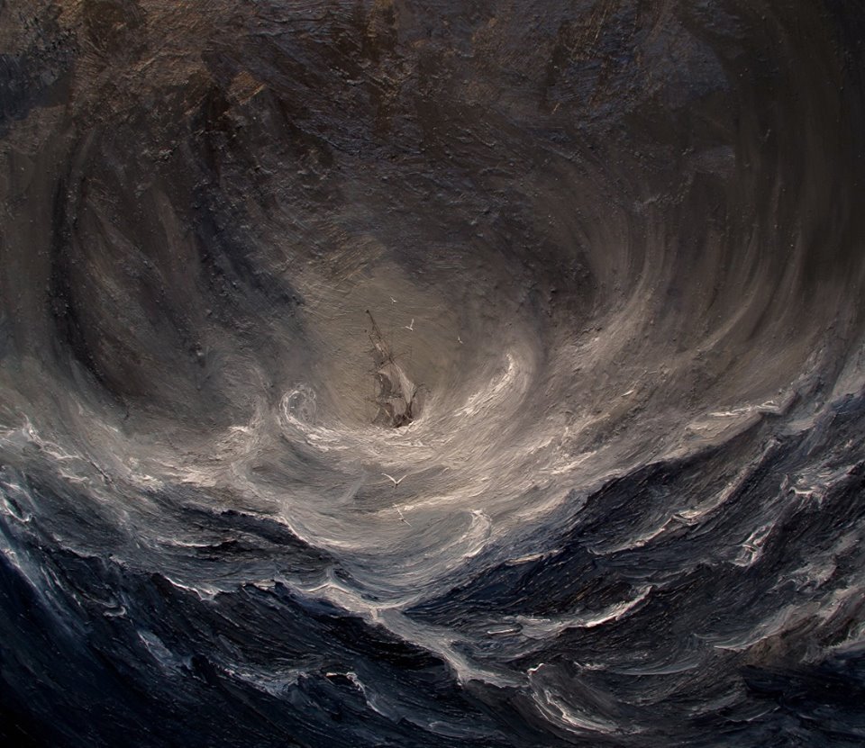
J.M.W. Turner, Snow Storm

More than anything else, this.

*********************

Squarespace has made a change in the 7.1 editor. It’s major. Fluid Engine is a grid-based system that enables a lot more customization, and potentially a lot more… havoc!

I had planned to spend a week in mid-August learning, but adding a new page to a client site today — there it was! Proceed! Now! It did feel —  freer? A bit like Canva. Dragging, resizing, layering, background block colors — a breeze. Expansive, more granular possibilities. Much less margin for error.

Squarespace is still renowned for its elegant look, and I hope the creative explosions coming out of Fluid Engine retain the sleek artistry that made the platform a standout from the beginning.

If you already have a 7.1 site or are just getting started, it’s an exciting time to get on board. Once you launch, I can stay close for updates. If you take over, the learning curve is simply different.

Doing fine customizations for mobile view is one of the best things about Fluid Engine. Most people will be encountering your site (at least at first) via smartphone. The more elegant your mobile site looks, the more likely you’ll intrigue and enchant your visitors.

Folk Musicians + Bandsintown

Photo by Edward Eyer for Pexels

I’m seeing an odd thing with folk musicians around my age and older. I’m not referring to musicians on the rocking side, traditional-ish, or those who’d be considered “Americana.” I’m talking about the ones who have Dylan and Mitchell in their bones, mostly. Singer-songwriter-y.

If they’re playing around some, say, a couple of events per month (including outdoors and streaming these days), yes— they usually have a newsletter. But when you visit their websites, the calendar has no connection to another ecosystem. Yes, some connect with a site with the initials RN, but…

Your calendar is one of the main ways you stay top-of-mind in the awareness of your listeners. An effective, functional website design for musicians should be integrated with Bandsintown, full stop. Over 560,000 artists are on it, from emerging to iconic. To find you, most people will still Google you. If you’re on BIT, you’ll be more prominent.

To stay high in the search rankings, update your site frequently. Excellent blog content is a good way to do that. Squarespace has simple, robust tools for making it happen (compared to other site builders folk musicians commonly use). It doesn’t have to be complicated. Those thoughts you put on Facebook or Instagram? Repurpose them into posts. Give it a few months. Chances are, your viewership will grow.

The 50+ folk music website scene is gathering dust. It’s high time to clean it out, open it up, and bring it in line with high-level design practices.


On the Other Side

This might be the least SEO-friendly entry in this journal. Yes, there are certain words and key phrases that drive search engines toward you. But this post is about something else.

For a long time, I’ve wanted to make a documentary that shows facial expressions in response to social media posts. Sometimes I feel as though much of the culture’s turned addict, all walled up in a prison of mirrors — the best, truest thinking says the opposite of addiction is connection.

I coordinate social media for a non-profit. If our posts don’t bring people together (not just for viewing), why have them at all? If cults of celebrity, personality, and unbalanced interactions edge out real, nourishing exchanges, what’s the point?

I’m not sure what any of this has to do with web design for musicians creatives solopreneurs in Atlanta, GA (there’s that long-tail keyword!) — but maybe, maybe if your gift calls for it, a comprehensive, stunning, real site that feels like you feel, sounds like you sound — can bring your people closer to you and each other — over time, trends, and the turning of the world.

And if you recognize the Kansas song in the title, hello!

Mobile. Friendly.

Case by Carved.

As 2021 draws to a close, piace🕊 Here, deep breaths, slow music-making, conversation, silence.

Still in the midst of a rebuild for a nonprofit. Intense, immersive. Recently, I pulled some stats regarding the percentage of internet traffic from mobile phones.

It’s approaching 70% now. 70%! So if you have a mental picture of your potential client viewing your website on a laptop or a tablet, that picture is out of date. Chances are, the phone is where you’ll first be discovered. Yes, that person may return to a larger device to really interact with your content. But that first impression is key.

No longer is it just an option to have a design and user experience that’s fully engaging and responsive on mobile. It’s necessary. Easy-to-navigate presence ≠ slick. The site can still have an organic feel. But even if your “dream clients” are a bit older, they’re probably accessing you on smartphones. Make it easy for them to find what they need. Make it fun. Make them stay…

But then, (preaching to myself!) after inspiring your visitors, the next step—releasing phones and returning to real life and the lives of others.

We’ll fine-tune your design to be captivating and accessible every which way, so your gift and guests truly connect.

Squarespace 7.1 — A Love Story

Dusan Kipic for Unsplash

Dusan Kipic for Unsplash

Squarespace 7.1 came out in 2020. It felt very beta. It was beta. Although I liked the backgrounds, palettes, and font packs, something felt strange. It flowed differently than I flow during the design process.

I had been used to pulling images and copy together, putting on the perfect music, grabbing the perfect scented oils, and going into a slightly altered state until I hit something that the platform wouldn’t let me do. Then: Google the CSS (out of necessity do I learn). Squarespace 7.0 was like an old, colorful friend. Then, the news: No more features being added to my beloved Brine family?! Unthinkable!

But — Squarespace 7.1 — in the last few weeks, you’ve captivated me with curves. First, the new backgrounds you’ve created for the sections. And now, you’ve given us rounded corners (adjustable!) for images and photos. I can make my clients’ dreams come true much faster and, yes, focus on function. Most of my work is web design for Baby Boomers and Gen X-ers (I’m right in there), and their visitors have to find what they need, stat. Aesthetics, YES! Not at the expense of ease.

Also, you’ve listened to your designers. When I’ve gone back in over the months, I’ve noticed you’ve made the flow… flowier. The less I have to use my analytical mind to make the magic happen, the better.

Keep going, Squarespace. Thank you.

Creatives and healers — it’s a great time to explore possibilities. I can’t wait to listen to you.

Classical Musician Websites + Bandsintown

Bandsintown for Classical Musicians

You’re a classical musician. Your professional life is probably some combination of orchestral dates, chamber music jobs, solos + recordings, and yes — even working in the non-classical world. You probably teach, too. That’s the beauty of it. It’s never boring. The things you see, hear, and experience bring you transcendent memories (and stories) for a lifetime. There’s nothing quite like it.

Chances are, you have a web presence for yourself or your group. Which has a calendar. The big question: What calendar is it?

I hope it’s Bandsintown — (using the intuitive Bandsintown Manager for artists). What? Isn’t that for . . . bands? Popular music? Well, yes, but not only “popular” music. Merriam-Webster:

Screen Shot 2021-09-01 at 5.10.16 PM.png

If you specialize in renaissance or medieval music, this probably isn’t too strange to you.

Here are three reasons why I passionately recommend Bandsintown for classical musicians:

  1. Exposure

    Currently, about 550,000 artists use Bandsintown, and a fair number are high-level classical “acts.” Chanticleer. The Atlanta Symphony Orchestra. Yo-Yo Ma. Around sixty-five million registered fans use it to find performances (streaming, too!), buy tickets, and keep up with their favorite artists. It’s easy to search for classical artists. Why not make it easy to find you?

  2. Integration

    Squarespace integrates beautifully with Bandsintown. All you have to do is update your BIT calendar, and the schedule automatically populates on your website. You don’t have to go into the website dashboard. And the way the calendar looks in Squarespace doesn’t scream PLUGIN. The integration pulls right from your site’s color palette. Sleek. Lovely.

  3. Communication

    Is a contractor looking at your calendar to decide if they’re going to contact you? Even if your Bandsintown calendar says “private event,” you’ve helped them not waste time or energy reaching out if you’re unavailable. Someone thinking of hiring you can get a read on the types of performances you do. BIT also has a full suite of artist tools. Want to send out a message to your followers? It’s easy and quick. You can also gain valuable information about your base using Insights.

Bandsintown is a game changer for musicians in all genres, including classical. It works in perfect harmony with Squarespace.