““It’s easy to find an experienced web designer with innovative layouts and an eye-catching presence. The difference that Carol brings is this: She is a multi-disciplinary creative who has supported countless other artists over the years. This gives her a naturally sophisticated down-to-earth consultative style that shows you how to make the most of your possibilities. Her infectious enthusiasm will help you easily untangle confusing decisions and her knack for knowing how to elegantly weave words and imagery will leave you wondering if she is just freaking touched by fire. She really is all that.”
~ Lauren Fincham | Singer/Songwriter & Visual Artist”
Lauren’s was the first full-featured Squarespace site I built, one that taught me about the ins and outs of the platform. It helped that we know each other well — I played with her when she lived in Atlanta and we’ve been dear friends for decades. Striking, moody photography (both hers and by other professionals), a recent album release with a strong graphic identity, her own artwork, and lots of copy from the 90s till now (great videos, too!) made acquiring “assets” super-easy and design a welcome challenge.
She was joy to work with, and had a strong point of view in addition to letting me run a little wild. A great combination! The look: sophisticated and intense. Her warmth came through, too. Lauren’s tech smarts make it easy for her to update on the fly. I was thankful for the chance to bring her site together and to bask in memories.
““I first connected in person with Carol at a house show that I played in Atlanta. I knew immediately that she and hers were “my people.” Thus began a working relationship/friendship.
The website was originally built by a friend, whose work I really appreciated. After visiting Carol‘s website, I had a pretty good idea that she was going to be terrific. I was right.
She took the elements that I forwarded to her and made a beautiful site. She has a great habit of staying aware and knowing when it’s time for a change or for more information to be posted. I appreciate her work almost as much as I appreciate her wonderful friendship, and the enthusiasm she has for what I do as an artist.”
~ Phil Madeira | Singer/Songwriter, Multi-instrumentalist, Producer, Author, Visual Artist, and member of Emmylou Harris’ “Red Dirt Boys” band ”
I’ve been aware of Phil Madeira and his music for quite a while, and had a chance to experience his artistry at the 2016 Americana Music Association Conference in Nashville (the Mercyland project) and later on at a house concert. When he was preparing to release a new solo album (OPEN HEART), he gave me an opportunity to redesign his site to reflect his current vitality and storied career.
Three mediums (music, visual art, and writing) expressed by Phil at such a high level made my head spin a little, but fortunately I had some experience to bring to the project. In a whirlwind of about four days, I backed up everything from his old site (just in case!) and received a wealth of material (stunning photography and essays). Lots of unfettered experimentation. It felt like mad visual improvisation, and certainly looked that way at first. The result: richly-hued with a touch of drama. When all was finished, I celebrated with sake and Phil might have heard my relieved exhale from miles away.
““I have worked with several web designers over the years and Carol is my favorite and by far the best. She is an artist with a real knack for design and detail. She is readily available and quickly responsive to questions and concerns. Best of all, she took what could have been a stressful process and made it fun and engaging.”
~ Grant Jackson, MD”
Grant’s a physician, with a fellowship from the Andrew Weil Center for Integrative Medicine. He’s branching out as a marketing copywriter specializing in medical/health and wellness topics, and wanted a site that was cleanly styled, open, friendly, bright — and professional.
He selected colors that highlight life-giving growth (green) and trust (blue). We had a great time balancing these influences, and giving the site a bit of an organic feel through the use of vintage typewriters in the imagery and tweaking the colors. On our working calls we had a lot of laughs. Several photos from a recent shoot, reams of informative and vivid copy for his portfolio/resource center, and we were ready to launch.
This site was completed in just over a week and leaves plenty of room to grow.
““Carol’s passionate about good design, patient, accessible — and best yet, appreciates the wonder of the viola.”
~ Reid Harris | Principal Viola Emeritus, Atlanta Symphony Orchestra”
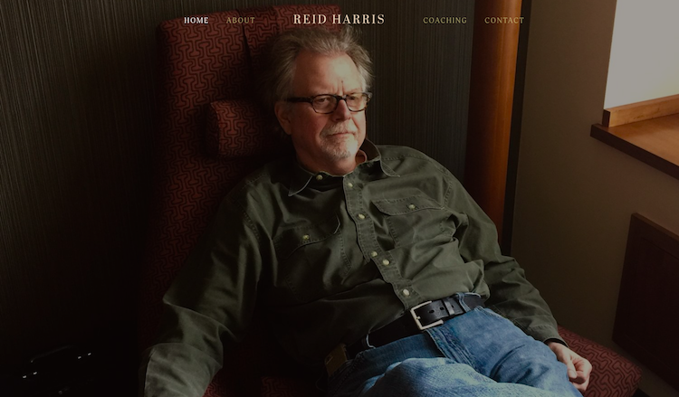
I took this photo of Reid Harris a few hours before he took the stage at Carnegie Hall with the Atlanta Symphony Orchestra in 2016. As he moved toward Emeritus status and I moved toward web design and went through a contemplative musicianship program, two things occurred to me: Squarespace is an elegant platform that I actually enjoy using, and Reid loves to coach instrumentalists. So why not explore its possibilities and create an introduction to his work, plus a way for players to contact him?
He’s a deep thinker and fine writer. I look forward to seeing his ideas take outward form.
““Carol is a dream to work with. She listens deeply and then goes in search of images and formatting that are beyond a perfect fit. I was doubly inspired by my own work when I saw the website Carol had created for me.”
~ Shelley Satonin | Nonprofit Leader & Musician
”
Performance coach, musician, and nonprofit leader Shelley Satonin was looking to develop an accessible, inviting site to attract and inspire her clients. We developed a soothing palette with pops of vibrance, chose a traditional site style with full-bleed banners for a touch of modern, and used a sidebar-style blog to provide a classic, easy-to-navigate source for her writings.
Though we used a bit of stock photography when necessary, we were so lucky to have beautiful images by her husband Eli. They provided a lovely personal touch to much of the site. Shelley’s an eloquent writer, so blogging came naturally.
Shelley and I are in the process of re-imagining her site.
We’re retaining the qualities that made her first site so appealing, while pushing the envelope a bit in terms of subject matter, color scheme, and dynamic content.
We’re excited about what the coming year will bring for her creative life and vocation.
Stay tuned for something wonderful!


